
Mobile-first web design means creating websites that work perfectly on phones and tablets before adapting them for desktop computers. It’s not just a design trend – it’s essential for business success in 2026. Here’s why your business needs a mobile-first approach.
What Mobile-First Design Means for Your Business
Mobile-first design puts your mobile customers at the centre of everything. Instead of creating a desktop website and trying to squeeze it onto a phone screen, we start by designing the perfect mobile experience first.
What This Means for Your Customers:
- Your website loads quickly on their phone
- Buttons and links are easy to tap with their thumb
- Content is easy to read without zooming in
- Navigation makes sense on a small screen
- Forms are simple to complete on mobile
What This Means for Your Business:
- More customers stay on your website longer
- Higher conversion rates from mobile visitors
- Better Google search rankings
- Increased sales and enquiries
- Professional image that builds trust
Why Your Customers Expect Mobile-First Design
Your Customers Are Mobile-First
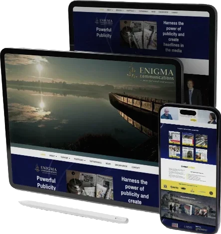
Think about how you use the internet. You probably grab your phone to:
- Search for local businesses whilst out shopping
- Check opening hours before visiting a store
- Read reviews whilst standing in a car park
- Compare prices before making a purchase
- Get directions to a business location
Your customers do exactly the same thing. They expect your website to work perfectly on their mobile device, and they’ll leave immediately if it doesn’t.
Mobile Users Have Different Needs
Mobile users behave differently than desktop users:
They’re Often in a Hurry:
- Need information quickly
- Want clear, simple navigation
- Don’t want to scroll through long pages
- Need prominent contact details
They’re Location-Aware:
- Often searching for nearby businesses
- Want directions and contact information
- Need opening hours and availability
- May call directly from search results
They’re Action-Oriented:
- Ready to make phone calls
- Want to book appointments immediately
- Need quick access to contact forms
- Expect instant responses
The Business Benefits of Mobile-First Design
1. Google Rewards Mobile-Friendly Websites
Google uses your mobile website to determine your search rankings through mobile-first indexing. If your mobile experience is poor, you’ll rank lower in search results – meaning fewer customers will find you.
Search Benefits:
- Higher rankings in Google search results
- More visibility for local searches
- Increased organic website traffic
- Better performance in “near me” searches
Our marketing and SEO services include mobile optimisation to ensure your website ranks well across all devices.
2. More Customers Complete Actions
Mobile-first design makes it easier for customers to do what you want them to do – whether that’s calling you, filling out a contact form, or making a purchase.
Conversion Improvements:
- More phone calls from your website
- Higher contact form completion rates
- Reduced cart abandonment for e-commerce
- Increased appointment bookings
3. Better Customer Experience Builds Trust
When your website works perfectly on mobile, customers trust your business more. They assume that if you pay attention to details like mobile usability, you’ll pay attention to their needs too.
Trust Factors:
- Professional appearance on all devices
- Easy access to contact information
- Smooth, frustration-free browsing
- Quick loading times show reliability
Don’t just take our word for it – see what our clients say about their improved mobile experience in our customer testimonials.
4. Stay Ahead of Your Competition
Many businesses still have poor mobile experiences. By investing in mobile-first design, you gain a significant competitive advantage.
Competitive Advantages:
- Customers choose you over competitors with poor mobile sites
- Better first impressions lead to more enquiries
- Professional image enhances your reputation
- Word-of-mouth recommendations increase
What Happens When Your Website Isn’t Mobile-First
Lost Customers
Studies show that 57% of users won’t recommend a business with a poorly designed mobile site. Even worse, 40% will go to a competitor’s site instead.
Customer Loss Indicators:
- High bounce rates on mobile devices
- Fewer mobile enquiries and phone calls
- Customers mentioning your website is “hard to use”
- Lower online reviews mentioning website issues
Poor Google Rankings
Google prioritises mobile-friendly websites in search results. If your site isn’t mobile-optimised, you’ll appear lower in search results, making it harder for customers to find you.
Damaged Professional Image
A poor mobile experience makes your business look outdated and unprofessional. Customers may question whether you’ll provide quality service if you can’t even provide a quality website.
Signs Your Website Needs Mobile-First Design
Current Website Problems
Navigation Issues:
- Menus are too small to tap accurately
- Links are too close together
- Hard to find contact information
- Confusing or hidden navigation
Content Problems:
- Text is too small to read comfortably
- Images don’t fit properly on screen
- Important information is buried
- Pages take too long to load
Form and Contact Issues:
- Contact forms are difficult to complete
- Phone numbers aren’t clickable
- Map and directions are hard to access
- Checkout process is complicated
Customer Feedback Signs
- Customers mention your website is “hard to use on mobile”
- Fewer phone calls and enquiries from website visitors
- High bounce rates in your website analytics
- Customers asking for information that’s already on your website
Key Elements of Effective Mobile-First Design
1. Simple, Clear Navigation
Mobile users need to find information quickly. Effective mobile navigation includes:
- Clear, prominent menu button
- Easy access to contact information
- Simple search functionality
- Logical page structure
2. Fast Loading Speed
Mobile users expect websites to load in 3 seconds or less. Slow websites lose customers immediately.
Speed Factors:
- Optimised images that load quickly
- Efficient website code
- Reliable hosting
- Minimal use of heavy plugins
Test your current website speed with Google’s PageSpeed Insights to see how your mobile performance measures up. Our hosting and maintenance services ensure your website loads quickly on all devices.
3. Touch-Friendly Design
Everything on your mobile site should be easy to tap with a thumb:
- Large, well-spaced buttons
- Easy-to-tap links
- Simple forms with large input fields
- Clear call-to-action buttons
4. Readable Content
Mobile content needs to be scannable and easy to read:
- Large, clear fonts
- Short paragraphs
- Bullet points and headings
- Important information highlighted
5. Local Business Features
Mobile users often need local information immediately:
- Click-to-call phone numbers
- Easy access to address and directions
- Opening hours prominently displayed
- Location-based services highlighted
How Mobile-First Design Improves Your Marketing
Better Social Media Performance
When people share your website on social media, mobile-first design ensures it looks great on all devices, leading to more engagement and shares.
Email Marketing Success
Most people read emails on their phones. Mobile-first design ensures that when customers click links in your emails, they have a great experience on your website.
Local SEO Benefits
Google’s local search algorithm favours mobile-friendly websites. Better mobile experience leads to higher local search rankings and more “near me” search visibility.
Online Advertising ROI
If you run Google Ads or Facebook advertising, mobile-first design improves your return on investment by converting more ad clicks into customers.
The Cost of Waiting
Immediate Costs
Every day you delay mobile-first design, you’re losing:
- Potential customers to competitors
- Google search ranking positions
- Revenue from mobile visitors
- Professional credibility
Long-term Impact
- Harder to recover lost search rankings
- Damaged online reputation
- Increased competition as others improve
- Higher costs to fix problems later
Making the Switch to Mobile-First
What to Expect
Timeline: Mobile-first redesigns typically take 4-8 weeks depending on website complexity.
Process: We work with you to understand your customers’ needs and create a mobile experience that drives results.
Results: Most businesses see improvements in mobile traffic, enquiries, and conversions within the first month.
Investment and Returns
Mobile-first design is an investment that pays for itself through:
- Increased website enquiries
- Better Google search performance
- Higher customer conversion rates
- Improved professional image
- Competitive advantage
Your Next Steps
1. Audit Your Current Mobile Experience
Test your website on different mobile devices. Ask yourself:
- Is it easy to find your contact information?
- Can you navigate without frustration?
- Do forms work properly?
- Does everything load quickly?
2. Get Professional Guidance
Mobile-first design requires expertise in user experience, technical implementation, and business strategy. Professional web developers understand how to create mobile experiences that drive business results.
3. Plan Your Mobile-First Strategy
Consider your customers’ mobile needs:
- What information do they need most urgently?
- What actions do you want them to take?
- How can mobile design support your business goals?
Ready to Go Mobile-First?
Your customers are already mobile-first – your website should be too. Mobile-first design isn’t just about staying current with technology; it’s about providing the best possible experience for your customers and growing your business.
At Spires Web Tech, we specialise in creating mobile-first web designs that help local businesses succeed online. Our approach focuses on your customers’ needs and your business goals, ensuring your mobile website drives real results.
Why Choose Our Mobile-First Approach:
- Over 15 years of experience creating successful business websites
- Deep understanding of how mobile users behave
- Focus on conversion and business growth
- Ongoing support and optimisation
- Local expertise with national-standard quality
Learn more about our experience and how we’ve helped businesses transform their mobile presence.
Don’t let poor mobile experience cost you customers. Contact us today for a free mobile website assessment and discover how mobile-first design can transform your business success.
Spires Web Tech creates mobile-first websites that help businesses grow. From web development to content writing, we ensure your website works perfectly for customers on every device.